

Utilization planner
The utilization planner shows your team's utilization and capacity on a timeline: who's planned on which projects and for how long, plus absences and the total utilization for each week. Use it to spot over- and under-utilization and to plan ahead.
Required rights
Read own planner assignments
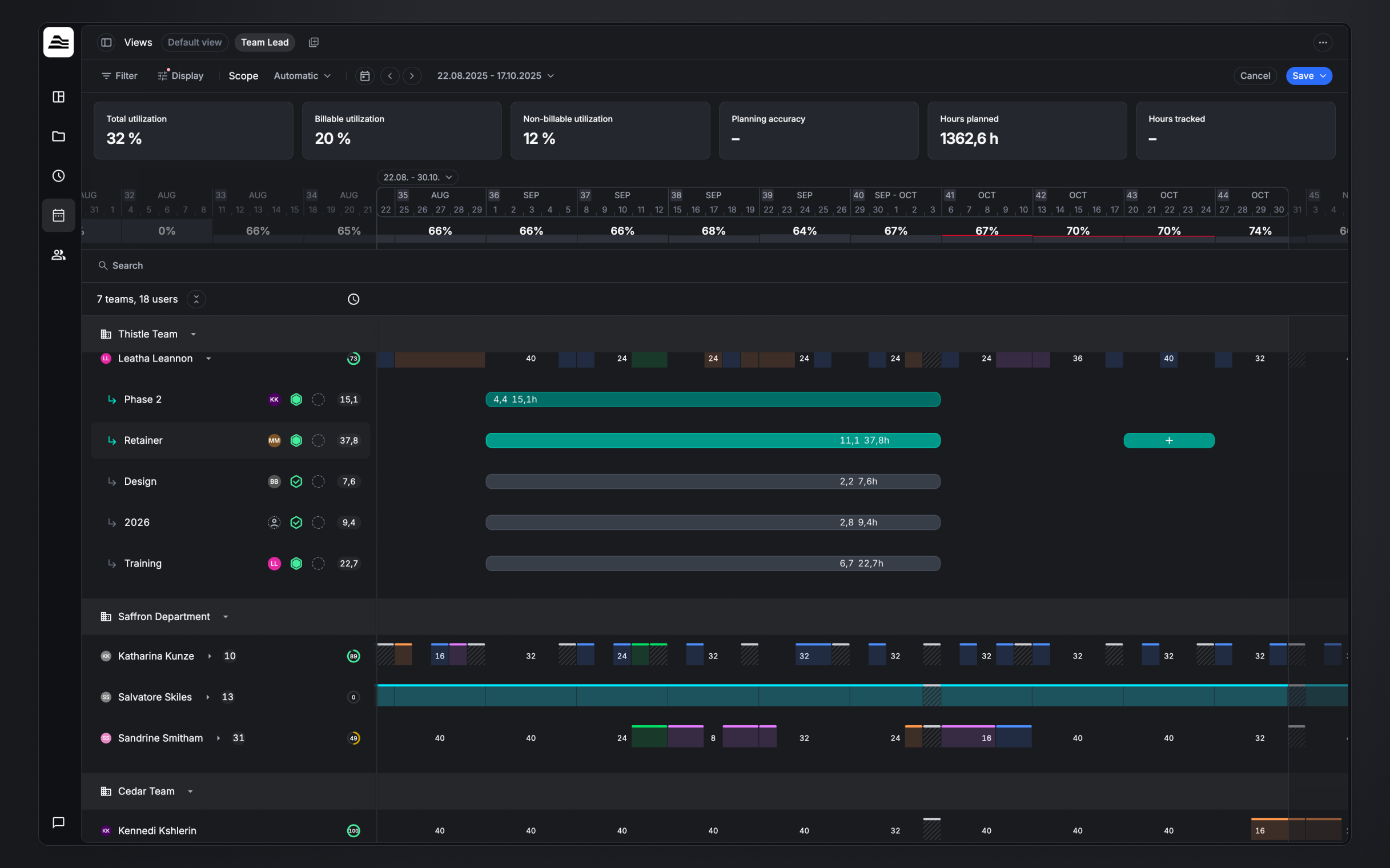
Reading the planner
- Staff rows. Each row is a staff member. The number next to a person is how many projects they're assigned to. Expand a person to see each project they're planned on, with the planned hours shown on the timeline.
- The donut. Each person's donut shows their utilization for the selected scope. Its ring is colour-coded against utilization thresholds, so you can spot under- and over-utilized people at a glance. Hover it for the full breakdown — utilization, the billable / non-billable / internal split, available capacity, and total capacity.
- Timeline cells. The grey cells with hours show either capacity or utilization per period, depending on the Availability Display setting (see below).
- Absences. Coloured bars running across a person's row are absences (for example Vacation).
- Weekly utilization. The row above the timeline shows total utilization per week. Hover a week for a per-team breakdown and a list of any over-planned staff (people planned beyond their capacity that week).
KPI cards
The cards across the top summarize the current view and scope. The default set:
- Total utilization — the share of the team's capacity that's planned, across all projects.
- Billable utilization — the share of capacity planned on billable projects.
- Non-billable utilization — the share of capacity planned on non-billable projects.
- Planning accuracy — how closely planned hours match the hours actually tracked.
- Hours planned — total planned hours in the scope.
- Hours tracked — total tracked hours in the scope.
Customize KPIs lets you choose which cards appear and drag them into the order you want. Beyond the utilization cards, you can add planner KPIs such as Effort forecast (billable time and expenses plus the value of future planned billable hours) and Profitability forecast (that effort compared with staff and expense costs). Toggle the whole strip on or off with Show KPIs.
Scope
Scope sets the timeframe that the per-person utilization/capacity figures and the KPI cards are based on:
- Automatic — the timeframe currently visible in your browser viewport.
- Custom — a date range you choose.
- All time — no timeframe limit.
Use the date arrows and calendar next to the scope to move the timeline.
Display options
Open Display to control what the planner shows:
- Show hidden employees — include staff that have been hidden from the view.
- Show KPIs — show or hide the KPI cards; Customize KPIs… picks and reorders them.
- Availability Display — choose how the timeline figures and availability are expressed:
- Utilization-based — show how utilized people are (planned against capacity).
- Capacity-based — show remaining capacity instead.
- Row options:
- Show project lead — show the project lead on each project row.
- Show status — show each project's status.
- Show health — show each project's health.
- Always show planning info — keep the planned hours/labels visible on the bars at all times, instead of only on hover.
Filtering
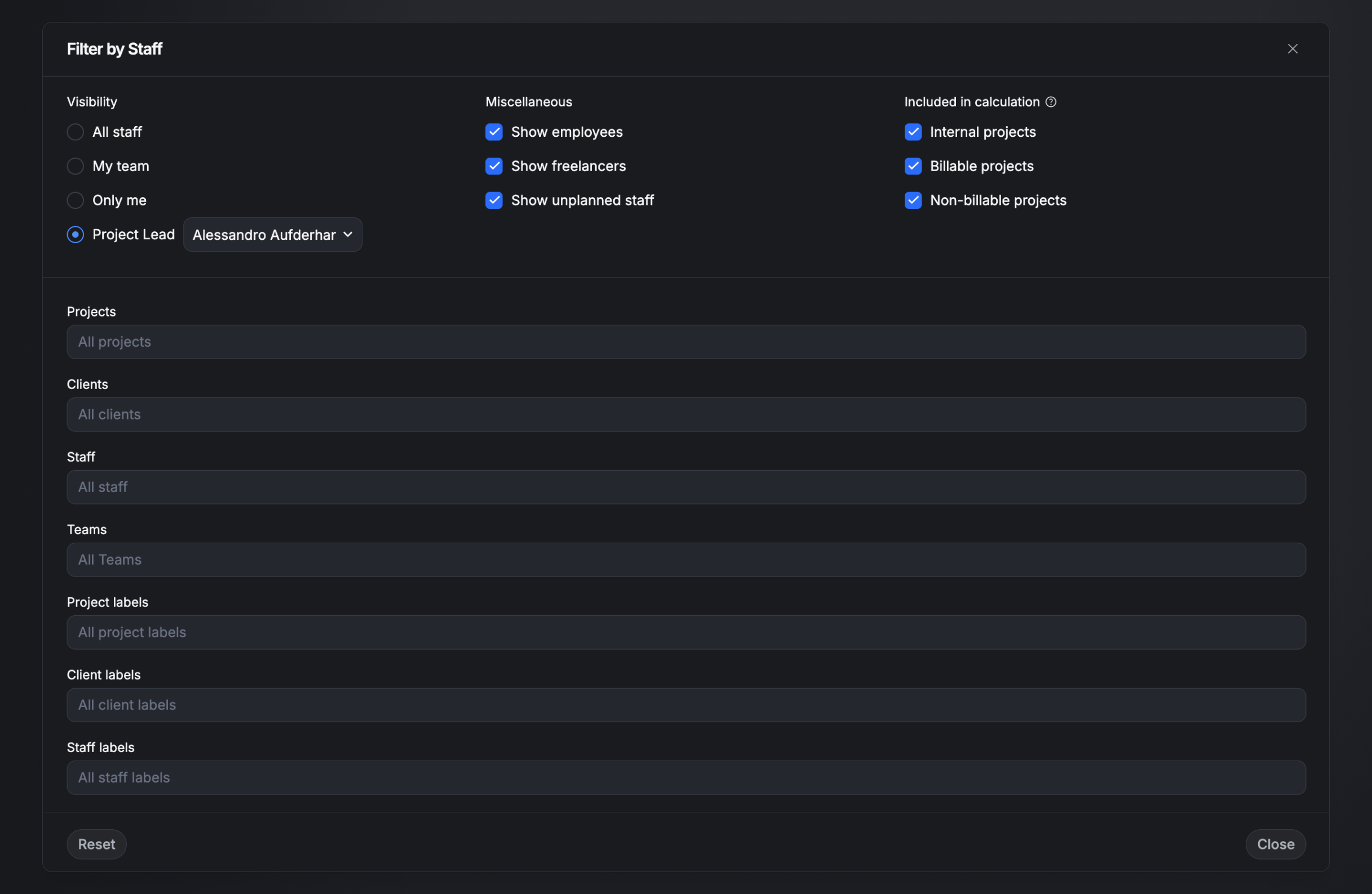
Open Filter to choose who and what is included:
- Visibility — All staff, My team, Only me, or Project Lead (pick a person to see the staff on their projects).
- Miscellaneous — Show employees, Show freelancers, Show unplanned staff (people with no planning entries).
- Included in calculation — choose which work counts toward the figures: Internal projects, Billable projects, Non-billable projects.
- Narrow by: Projects, Clients, Staff, Teams, Project labels, Client labels, Staff labels.
- Reset clears all filters.
Search
The search bar narrows the list to specific teams, skills, labels, and staff members. Add several conditions at once — for example a team plus a skill.
- Skills. Add a skill, then click it to set the minimum required level (Beginner → Master). Only people who meet it are shown.
- Row indicators. When you search, each row can show two labels: a skill-match indicator (gem icon) — how well that person's skills match the searched skill and level, shown as a colour-coded bar — and a capacity indicator (clock icon).
Views
Save a configured planner — its filters, display options, and scope — as a named view (e.g. Team Lead) and switch between your views and the Default view with one click.